Strategy
TTC
The Technique Crafters
Context
From the very beginning, TTC focused on quality: a distinctive identity, bold branding, and an unforgettable atmosphere. The visual identity was developed by Simone Brillarelli, an Italian artist who, inspired by the Cuban boxing tradition, created the club's dynamic graphic language.
Challenge
TTC had strong foundations: a distinctive brand identity, a unique space, and ambitious growth plans. The challenge was to define a clear vision, narrative, and communication system that would allow the club to expand without losing its authenticity - both for the original location and future venues, especially with the addition of a new brand ambassador.
Solution
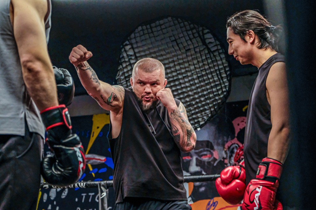
We anchored the brand around one undeniable truth: consciously understanding and mastering movement is the key to holistic growth. Based on this core idea, we structured the TTC experience - from the vision for new club locations, through signature training programs, to a coherent communication narrative. We also introduced Łukasz "Juras" Jurkowski into the strategy; his credibility and passion became a testament to TTC’s ambitions.
Effect
Today, TTC is a club that operates according to its own rules – a place where technique, sports passion, and authentic character reign. It has something of a journey through different cultures: the energy of Cuban boxing intertwines here with inspirations from various parts of the world. The addition of Juras - a man who lives sports every day - only confirms that TTC is not just another training room, but a space for people who expect something different than a typical workout. Today, it is one club, but TTC's ambitions reach far beyond.
Credits:
Brand designer: Simone Brillarelli
Photography: Pola Sobuń
Video: Krzysztof Flis
Category
Strategy
Zakres projektu
strategia
brand ambassador
art direction
key visual